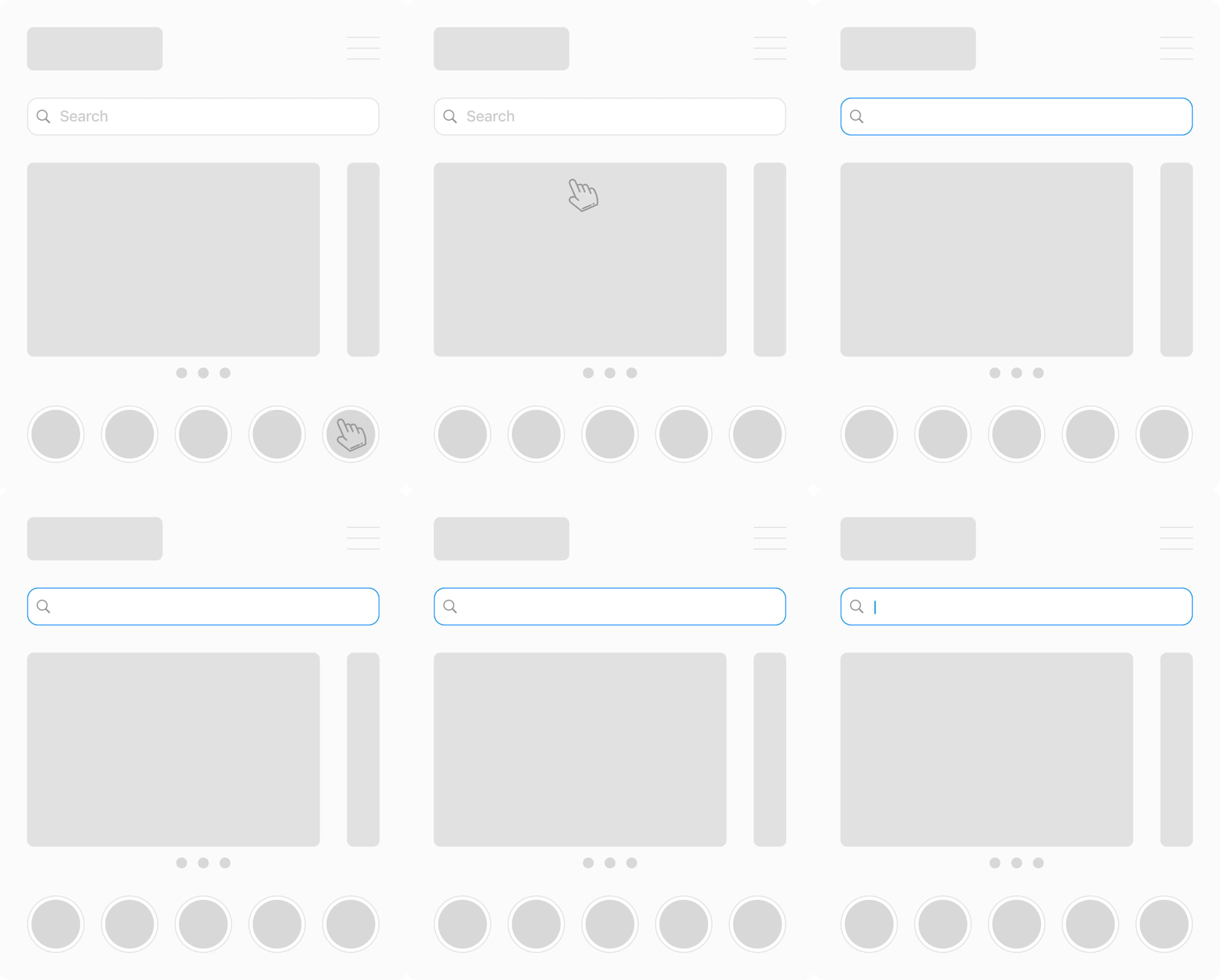
How to Stop Mobile Browsers from Auto‑Zooming on Form Inputs
If you have ever tapped a form field on your iPhone only to have Safari aggressively zoom in, you know how disruptive this default behavior can be. The sudden magnification breaks your design’s rhythm, forces the user to pinch back out, and makes a polished web app feel clunky compared to a native experience.
In this in‑depth guide we will look at why iOS and some Android browsers auto‑zoom on inputs, how that behavior impacts accessibility, and several proven strategies to disable or mitigate unwanted zooming—without alienating users who genuinely need to enlarge your content.
Why Mobile Browsers Zoom on Focused Inputs
Mobile operating systems prioritise readability. Apple’s Human Interface Guidelines state that interactive text smaller than 16 px may be difficult for users with low or mid‑range vision. Safari therefore compensates by increasing the page scale when a small‑font input receives focus.
- Font‑size threshold: Any
<input>,<textarea>, or<select>element rendered at15 pxor smaller triggers zoom. - Viewport mis‑configuration: A missing or conflicting
<meta name="viewport">tag may cause unexpected scaling. - Non‑responsive layouts: Fixed‑width designs force browsers to shrink the page to fit, increasing the likelihood that text falls below the readability threshold.
Android Chromium used to mirror this behavior, but most modern Android browsers have relaxed automatic zoom. Safari on iOS, however, still enforces the rule to comply with WCAG accessibility recommendations.
Solution 1 – Increase Input Font Size (Recommended)
The most accessible fix is to ensure that form controls use a font-size of at least 16 px (or the rem equivalent). This value keeps text legible for the majority of users and satisfies Safari’s heuristic, allowing users who rely on pinch‑to‑zoom to keep that functionality.
input,
textarea,
select {
  font-size: 1rem; /* = 16px if root is 16px */
}
Pros: Maintains user‑controlled zoom, fully meets accessibility best practices. Cons: May require UI tweaks—buttons, labels, and containers must grow with the new text size.
Solution 2 – Lock the Viewport Scale (Use Sparingly)
If you cannot adjust font sizing, you can instruct the browser not to zoom by capping the viewport’s maximum scale. Add maximum-scale=1 to your viewport meta tag:
<meta name="viewport"
      content="width=device-width, initial-scale=1, maximum-scale=1">
Warning: This technique
Solution 3 – Design with Responsive Typography
For production‑grade interfaces, combine rem-based typography with clamp() in CSS. This allows text to scale fluidly between a safe minimum and maximum range as the viewport changes.
html {
  font-size: clamp(16px, 1.1vw + 0.5rem, 18px);
}
Responsive typography ensures that small devices never drop below the 16 px threshold, while larger screens get proportionally larger text for comfort.
Solution 4 – Adopt a Mobile‑First Layout
A mobile‑first approach keeps layouts fluid and avoids desktop‑centric dimensions that cause down‑scaling. When elements occupy the full viewport width, there’s no need for Safari to shrink the page — and therefore less chance it will later decide to zoom in.

Putting It All Together
- Set
<meta name="viewport" content="width=device-width, initial-scale=1">early in your<head>. - Use
16 px(1 rem) or larger font size for all interactive fields. - Employ
remandclamp()for scalable typography. - Test on real iOS devices—emulators occasionally miss subtle zoom triggers.

Frequently Asked Questions
Does Android still auto‑zoom on inputs?Most modern Android browsers no longer enforce input zoom. Older WebKit‑based browsers may still do so if text is exceptionally small.
Will maximum‑scale=1 harm my SEO?Search engines do not penalise this attribute directly, but poor accessibility can indirectly affect user engagement, which in turn influences ranking signals like dwell time and bounce rate.
Key Takeaways
- Use at least 16 px font size for interactive elements to satisfy Safari’s accessibility heuristic.
- Lock viewport scaling only if you have extremely strong design justification and alternative accessibility options.
- Test across devices – what works on Chrome Android might not on Safari iOS.
By proactively addressing input zoom issues, you deliver a seamless, app‑like experience that keeps users engaged and improves conversion rates—an SEO win on usability alone.
Written by updated on July 2, 2025. Feel free to share with attribution.


