Automatic zoom of input fields
Ever found yourself clicking on an input field on your mobile phone to populate it with data just to get zoomed-in on page? How often did you have to pinch out and reverse the action to continue browsing?
The auto zoom-in is kind of a deal breaker for web apps or sites that want to behave native on mobile.
This is an even more sensitive topic when it comes back haunting you after building it yourself.

This is a new di
I’ve developed for so long platforms not paying attention to this or knowing you can actually avoid the effect from kicking-in.
And there’s a way to transform this experience into a seamless one. Let’s start by taking a look at why the effect is added into a web page in the first place.
There are well established reasons why the zoom-in happens
There is a wide variety of users out there that consume content differently, just like you and me. Some prefer a higher resolution (aka fit more into the screen), while others opt for a lower one (as in, show each element larger) due to visual accessibility reasons.
Most native applications are self- aware and adaptable to the user preferences in a device, whereas web pages are mostly driven by their independent styling and code base. This is the reason why, on native apps, you will not encounter such a behaviour.
Here are the top causes triggering the auto zoom-in when clicking an input field:
the font size may be too small for the input field, the device, OS or browser classifying it under a certain threshold for a proper readability
the page’s viewport settings may be set incorrectly, creating visual glitches or disrupting the layout
apps or websites may not be optimized for responsive design, devices requiring magnification to compensate for small & hard-to-interact with elements
The zoom-in effect on input fields is mostly prevalent on iOS devices and comes as a measure taken by Apple to assure accessibility for visually impaired, simply by counteracting the negative effects of the points above.
If you’ve just discovered this and you’re struggling with it, chances are that the small font-size of a given element is the main cause for such behaviour.
The solution to play along with this behaviour?
1. Setting a maximum viewport scale
If you’re keen on your layout, there is an option which will deny the browser to zoom-in on a given focused field, despite its properties.
⚠️ This measure is discouraged by best practices, as it can negatively impact visually impaired persons from pinching- or zooming-in on a website. Make sure that, if you take such an approach, you do it on well-established grounds.
The eliminate the effect, modify your viewport meta tag to contain a maximum-scale=1, like this:
<meta name="viewport" content="width=device-width, initial-scale=1, maximum-scale=1">Now your page will stick to a maximum scale of the original viewport and you will not be zoomed-in again, even when interacting with smaller sized elements.
2. Increasing the font size
Out of everything I’ve researched or tested so far, this seems to be the commonly accepted & recommended solution, as it does not interfere in any way with the accessibility features.
Apple devices (iOS) on Safari, Chrome or related browsers will zoom-in on any input field that has font-size: 15px; or smaller. Setting thus the font size to any given input field to the equivalent of at least 16px should do the trick.
With this approach, you’d actually be checking two items:
the browser doesn’t zoom-in automatically into your content ✅
users that need to zoom-in by choice can still do it, unrestricted ✅
While implementing the minimum size, there is the chance that your design will have to be adjusted as well. Make sure the change displays & behaves well against your other layout elements.
These 2 solutions are mostly useful from a development perspective, when the issue has already happened and needs fixing.
If you’re coming from the product side, make sure to cover this aspect through the discovery, requirements & mockups phases, to completely avoid the automatic zoom-in effect in the first place.
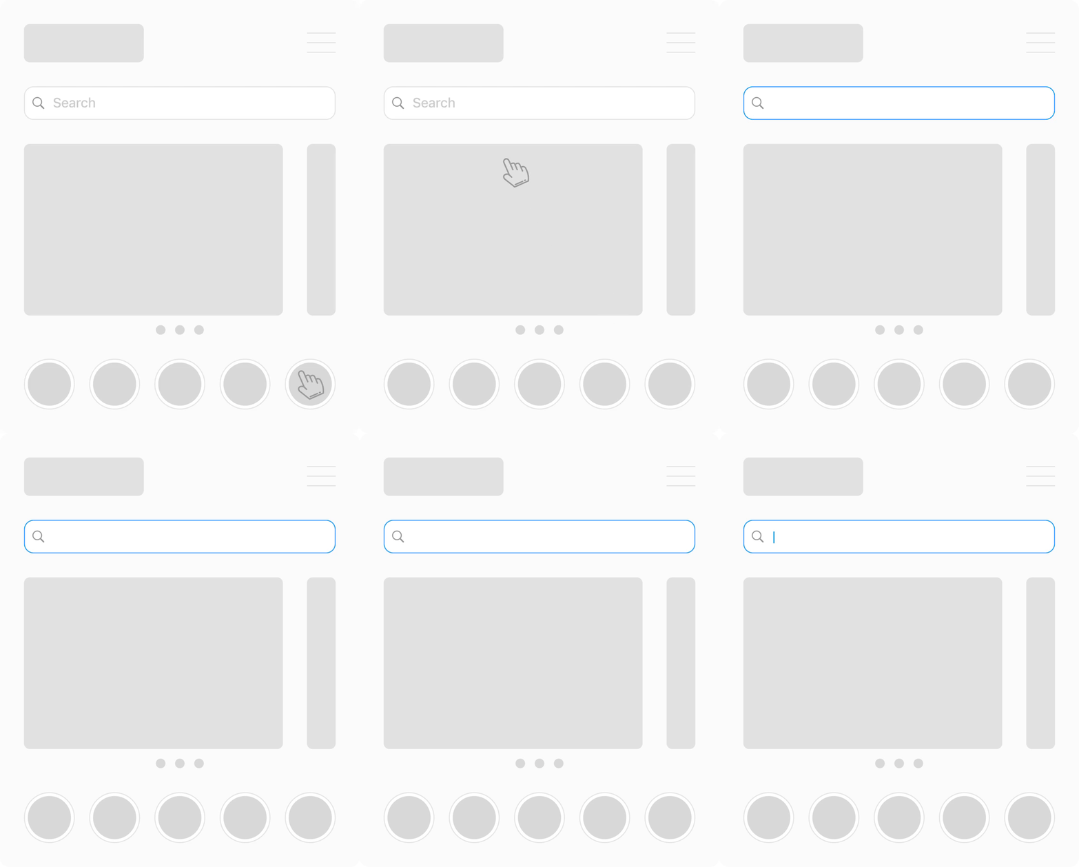
In the end, this is what you’ll be going to have:

Simple, straightforward and in the same time too specific to be obvious at first. Perfectionists will love it though.


